Deliverables
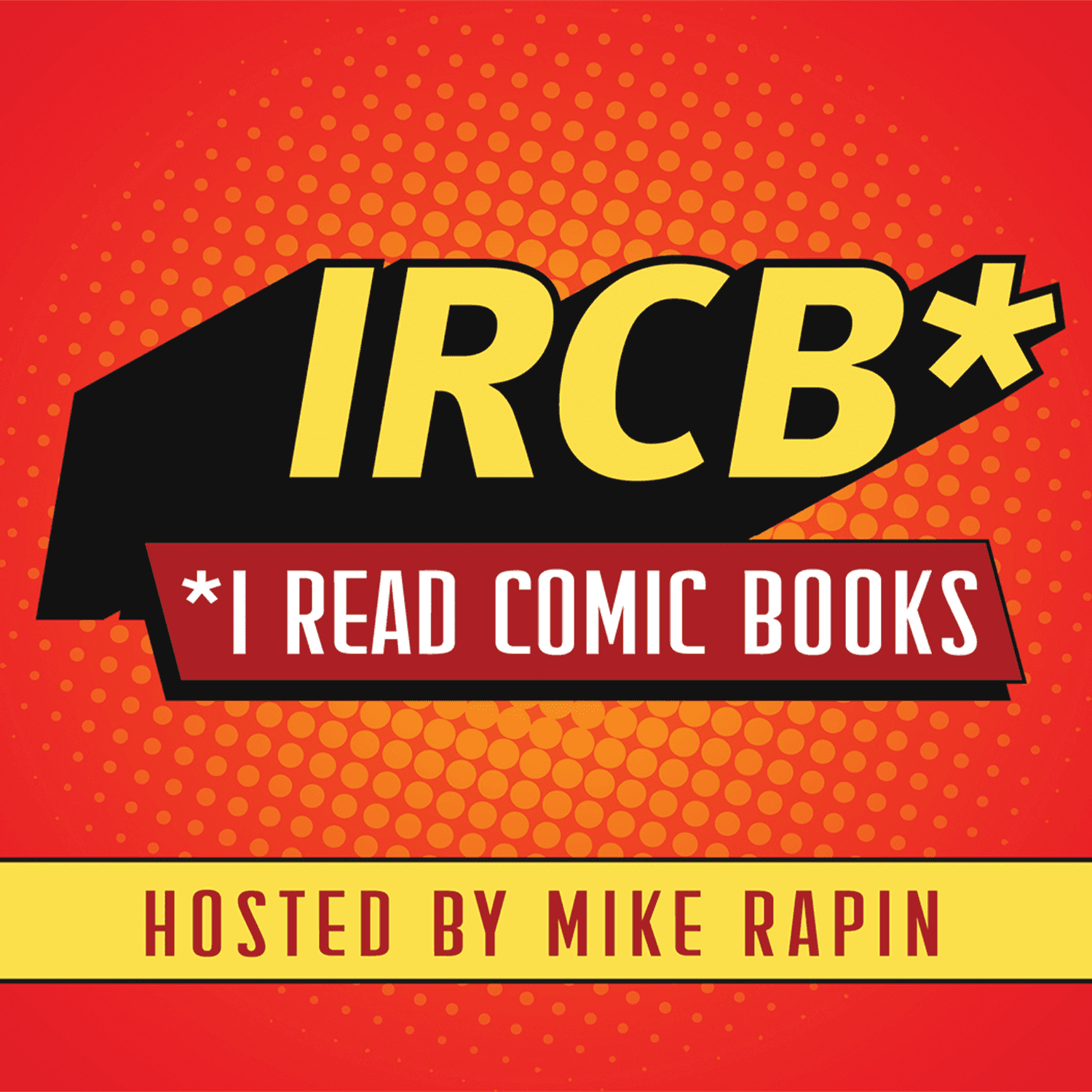
Logo system (IRCB + full name lockup)
Visual identity system
Podcast cover artwork
Business cards
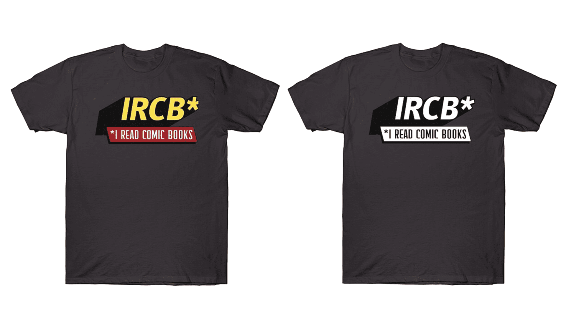
T-shirt design
The Challenge
Update the brand to feel more polished and contemporary without losing the existing equity built with listeners and contributors.
Approach
Refined the logo and visual system while retaining key elements, including the established color palette and comic-inspired design language.
Introduced “IRCB” as the primary mark to reflect how the audience commonly refers to the show, supported by a secondary lockup using an asterisk and footnote-style treatment—a nod to classic comic editor’s notes.
The Result
Delivered an updated identity that maintains familiarity while improving clarity and flexibility across applications. The system has been widely adopted across podcast materials and merchandise, and has been embraced by contributors and fans, including use within guest-created comic artwork.